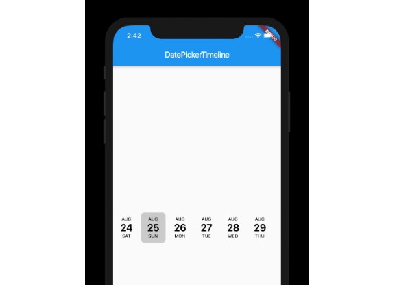
Wednesday 4 September 2019

Flutter Date Picker Library that provides a calendar as a horizontal timeline


DatePickerTimeline

Flutter Date Picker Library that provides a calendar as a horizontal timeline.

How To Use

Import the following package in your dart file
import 'package:date_picker_timeline/date_picker_timeline.dart';

Usage

Use the DatePickerTimeline Widget
    Column(
        mainAxisAlignment: MainAxisAlignment.center,
        children: <Widget>[
          DatePickerTimeline(
            DateTime.now(),
            onDateChange: (date) {
              // New date selected
              print(date.day.toString());
            },
          ),
        ],
    ),
Constructor:
    DatePickerTimeline(
        this.currentDate, {
        Key key,
        this.dateSize = Dimen.dateTextSize,
        this.daySize = Dimen.dayTextSize,
        this.monthSize = Dimen.monthTextSize,
        this.dateColor = AppColors.defaultDateColor,
        this.monthColor = AppColors.defaultMonthColor,
        this.dayColor = AppColors.defaultDayColor,
        this.selectionColor = AppColors.defaultSelectionColor,
        this.onDateChange,
      }) : super(key: key);

GitHub

Flutter Date Picker Library that provides a calendar as a horizontal timeline — Read More
Latest commit to the master branch on 9-3-2019
Download as zip


Bottom navigation bar that you can customize with flutter


Bottom Personalized Dot Bar

A bottom navigation bar that you can customize with the options you need, without any limits. You can also customize the appearance of the navigation bar.

Demo example (Mobile)


Demo example (Tablet 1)


Demo example (Tablet 2)


Package overview

  • [x] Drag and Drop your options!
  • [x] Change icon colors
  • [x] Listen to events 'Sort, Insert and Delete'
  • [x] Dynamically change the selected option
  • [x] Custom options
  • [x] Unlimit options
  • [x] Option to define custom item background color
  • [x] And more ...

Getting Started

Add the plugin:

dependencies:
  ...
  bottom_personalized_dot_bar: ^1.0.2
YAML

Import the package

import 'package:bottom_personalized_dot_bar/bottom_personalized_dot_bar.dart';

How to use?

Important! dont use 'bottomNavigationBar' of Scaffold, because it occupies the entire screen, you need to add it inside a Stack.
To add the Options list, you must create BottomPersonalizedDotBarItem, and each must have the unique attribute 'keyItem'.
To modify the selected option, you must update the attribute keyItemSelected of the BottomPersonalizedDotBar
String _itemSelected = 'item-1';
...
..
.
Scaffold(
  body: Stack(
    children: <Widget>[
      .... // Your App Home
      BottomPersonalizedDotBar(
          keyItemSelected: _itemSelected,
          doneText: 'Done',
          settingTitleText: 'Your Menu',
          settingSubTitleText: 'Drag and drop options',
          iconSettingColor: const Color(0xFFFFD201),
          buttonDoneColor: const Color(0xFFFFD500),
          settingSubTitleColor: const Color(0xFFFECE02),
          hiddenItems: <BottomPersonalizedDotBarItem>[
              BottomPersonalizedDotBarItem('item-4', icon: Icons.cloud, name: 'Nube', onTap: (itemSelected) { /* event selected */ }),
              BottomPersonalizedDotBarItem('item-5', icon: Icons.access_alarm, name: 'Alarma', onTap: (itemSelected) { /* event selected */ }),
              BottomPersonalizedDotBarItem('item-6', icon: Icons.message, name: 'Mensaje', onTap: (itemSelected) { /* event selected */ }),
              BottomPersonalizedDotBarItem('item-7', icon: Icons.notifications, name: 'Alerta', onTap: (itemSelected) { /* event selected */ }),
              BottomPersonalizedDotBarItem('item-8', icon: Icons.security, name: 'Seguridad', onTap: (itemSelected) { /* event selected */ }),
              BottomPersonalizedDotBarItem('item-9', icon: Icons.help, name: 'Ayuda', onTap: (itemSelected) { /* event selected */ }),
              BottomPersonalizedDotBarItem('item-10', icon: Icons.settings, name: 'Config.', onTap: (itemSelected) { /* event selected */ }),
          ],
          items: <BottomPersonalizedDotBarItem>[
              BottomPersonalizedDotBarItem('item-1', icon: Icons.sentiment_very_satisfied, name: 'Flutter', onTap: (itemSelected) { /* event selected */ }),
              BottomPersonalizedDotBarItem('item-2', icon: Icons.favorite_border, name: 'Favorito', onTap: (itemSelected) { /* event selected */ }),
              BottomPersonalizedDotBarItem('item-3', icon: Icons.face, name: 'Perfil', onTap: (itemSelected) { /* event selected */ }),
          ],
      ),
    ],
  ),
);
Dart

Customization

BottomPersonalizedDotBar

ATTRIBUTEDESCRIPTION
itemsList of items to be displayed in the navigation bar
hiddenItemsList of items that will be hidden
keyItemSelectedItem key that is selected
widthNavigation bar width
heightNavigation bar height
borderRadiusNavigation bar radius
selectedColorIconSelected Icon color
unSelectedColorIconUnselected Icon color
navigatorBackgroundNavigator Container Background color
settingBackgroundSetting Container Background color (Hidden items)
iconSettingSettings button icon
iconSettingColorSettings button icon color
settingTitleTextSetting Title Text
settingTitleColorSetting Title color
settingSubTitleTextSetting Sub-Title Text
settingSubTitleColorSetting Sub-Title color
doneTextDone button Text
textDoneColorText Done Color
buttonDoneColorButton done color
hiddenItemBackgroundBackground of hidden item
iconHiddenColorIcon Hidden Color
textHiddenColorText Hidden Color
dotColorSelection Indicator Color (Dot
boxShadowShadow of container
onOrderHideItemsEvent when you sort the hidden options, this has as parameter the list of hidden options with the new order. onOrderHideItems: (List<BottomPersonalizedDotBarItem> hiddenItems) { /* Your action */ }
onOrderItemsEvent when ordering browser options, this has as parameter the list of options with the new order onOrderItems: (List<BottomPersonalizedDotBarItem> items) { /* Your action */ }
onAddItemEvent when you add a new option to the navigation bar, this has as parameters the item you add and the list of options. onAddItem: (BottomPersonalizedDotBarItem itemAdd, List<BottomPersonalizedDotBarItem> items) { /* Your action */ }
onRemoveItemEvent when you delete an option from the navigation bar, this has as parameters the element to delete and the list of hidden options. onRemoveItem: (BottomPersonalizedDotBarItem itemRemove, List<BottomPersonalizedDotBarItem> hiddenItems) { /* Your action */ }

BottomPersonalizedDotBarItem

ATTRIBUTEDESCRIPTION
keyItemUnique key
iconItem icon
nameItem name
onTapEvent with you press the item. onTap: (String keyItem) { /* Your action */ }

GitHub

Bottom Personalized Dot Bar — Read More
Latest commit to the master branch on 8-23-2019
Download as zip