Saturday 13 July 2019

A highly customisable Flutter widget for entering pin code

flutter tutorial,flutter,flutter tutorial for beginners,flutter app,flutter tutorials,flutter sdk,tutorial,flutter course,learn flutter,flutter tutorial ios,flutter firebase tutorial,flutter widgets,flutter app development tutorial,flutter ios,flutter dart,flutter android,google flutter,flutter sdk tutorial,flutter tutorial app,google flutter tutorial,flutter sqflite tutorial,flutter tutorial deutsch,flutter tutorial android


pin_code_text_field

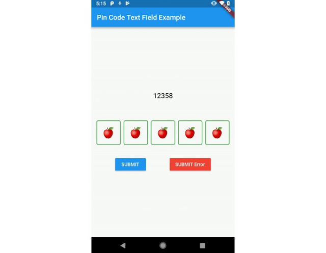
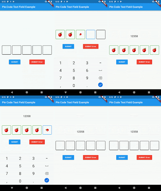
It's a Flutter widget for entering pin code. Suitable for use cases such as login and OTP.

Usage

Use this package as a library

  1. Depend on it
    Add this to your package's pubspec.yaml file:
dependencies:
  pin_code_text_field: ^1.2.1
  1. Install it
    You can install packages from the command line:
    with Flutter:
$ flutter packages get
Alternatively, your editor might support flutter packages get. Check the docs for your editor to learn more.
  1. Import it
    Now in your Dart code, you can use:
import 'package:pin_code_text_field/pin_code_text_field.dart';

API

NAMETYPEDEFAULTDESCRIPTION
maxLengthint4The total length of pin number & the number of pin boxes.
hideCharacterboolfalseShow or hide the pin code.
highlightboolfalsehighlight the focused pin box.
highlightColorColorColors.blackSet color of the focused pin box.
pinBoxDecorationBoxDecorationProvidedPinBoxDecoration._defaultPinBoxDecorationCustomization for the individual pin boxes. Check ProvidedPinBoxDecoration for possible options.
pinTextStyleTextStyleTextStyle for styling pin characters.
maskCharacterString"\u25CF"Special character to mask the pin code. Will only work if hideCharacter is set to true.
pinBoxHeightdouble70.0Height of pin boxes.
pinBoxWidthdouble70.0Width of pin boxes.
onDonevoid Function(String)Callback when the max length of pin code is reached.
hasTextBorderColorColorColors.blackSet color of pin box containing text.
pinTextAnimatedSwitcherTransitionFunction(Widget child, Animation animation)Animation of text appearing/disappearing, you can write your own or use a few presets: 1. PinCodeTextField.awesomeTransition 2. PinCodeTextField.defaultScalingTransition 3. PinCodeTextField.defaultRotateTransition
pinTextAnimatedSwitcherDurationDurationconst Duration()Duration of pinTextAnimatedSwitcherTransition. Check ProvidedPinBoxTextAnimation for possible options.
errorBorderColorColorColors.redHighlight all textboxes to this color if hasError is set to true
onTextChangeFunction(String)callback that returns a text on input
hasErrorboolfalseset all border color to errorBorderColor
autofocusboolfalseAutofocus on view entered
wrapAlignmentWrapAlignmentWrapAlignment.startAlignment of the wrapped pin boxes
pinCodeTextFieldLayoutTypePinCodeTextFieldLayoutTypePinCodeTextFieldLayoutType.NORMALAuto adjust width with PinCodeTextFieldLayoutType.AUTO_ADJUST_WIDTH, wrap the pin box row with PinCodeTextFieldLayoutType.WRAP

Example


class MyHomePageState extends State<MyHomePage> {
  TextEditingController controller = TextEditingController();
  String thisText = "";
  int pinLength = 4;

  bool hasError = false;
  String errorMessage;


  @override
  Widget build(BuildContext context) {
    return Scaffold(
      appBar: AppBar(
        title: Text("Pin Code Text Field Example"),
      ),
      body: Container(
        child: SingleChildScrollView(
          child: Column(
            mainAxisAlignment: MainAxisAlignment.center,
            crossAxisAlignment: CrossAxisAlignment.center,
            children: <Widget>[
              Padding(
                padding: const EdgeInsets.only(bottom: 60.0),
                child: Text(thisText, style: Theme.of(context).textTheme.title),
              ),
              PinCodeTextField(
                autofocus: false,
                controller: controller,
                hideCharacter: true,
                highlight: true,
                highlightColor: Colors.blue,
                defaultBorderColor: Colors.black,
                hasTextBorderColor: Colors.green,
                maxLength: pinLength,
                hasError: hasError,
                maskCharacter: "😎",

                onTextChanged: (text) {
                  setState(() {
                    hasError = false;
                  });
                },
                onDone: (text){
                  print("DONE $text");
                },
                pinCodeTextFieldLayoutType: PinCodeTextFieldLayoutType.AUTO_ADJUST_WIDTH,
                wrapAlignment: WrapAlignment.start,
                pinBoxDecoration: ProvidedPinBoxDecoration.underlinedPinBoxDecoration,
                pinTextStyle: TextStyle(fontSize: 30.0),
                pinTextAnimatedSwitcherTransition: ProvidedPinBoxTextAnimation.scalingTransition,
                pinTextAnimatedSwitcherDuration: Duration(milliseconds: 300),
              ),
              Visibility(
                child: Text(
                  "Wrong PIN!",
                  style: TextStyle(color: Colors.red),
                ),
                visible: hasError,
              ),
              Padding(
                padding: const EdgeInsets.only(top: 32.0),
                child: Row(
                  mainAxisAlignment: MainAxisAlignment.spaceEvenly,
                  children: <Widget>[
                    MaterialButton(
                      color: Colors.blue,
                      textColor: Colors.white,
                      child: Text("+"),
                      onPressed: () {
                        setState(() {
                          this.pinLength++;
                        });
                      },
                    ),
                    MaterialButton(
                      color: Colors.blue,
                      textColor: Colors.white,
                      child: Text("-"),
                      onPressed: () {
                        setState(() {
                          this.pinLength--;
                        });
                      },
                    ),
                    MaterialButton(
                      color: Colors.blue,
                      textColor: Colors.white,
                      child: Text("SUBMIT"),
                      onPressed: () {
                        setState(() {
                          this.thisText = controller.text;
                        });
                      },
                    ),
                    MaterialButton(
                      color: Colors.red,
                      textColor: Colors.white,
                      child: Text("SUBMIT Error"),
                      onPressed: () {
                        setState(() {
                          this.hasError = true;
                        });
                      },
                    ),
                  ],
                ),
              )
            ],
          ),
        ),
      ),
    );
  }
}

Dart

Wishlist

  1. Localization (L-R, R-L)
  2. Highlight animation.
  3. Pin Box animation.
flutter tutorial,flutter,flutter tutorial for beginners,flutter app,flutter tutorials,flutter sdk,tutorial,flutter course,learn flutter,flutter tutorial ios,flutter firebase tutorial,flutter widgets,flutter app development tutorial,flutter ios,flutter dart,flutter android,google flutter,flutter sdk tutorial,flutter tutorial app,google flutter tutorial,flutter sqflite tutorial,flutter tutorial deutsch,flutter tutorial android


flutter tutorial,flutter,flutter tutorial for beginners,flutter app,flutter tutorials,flutter sdk,tutorial,flutter course,learn flutter,flutter tutorial ios,flutter firebase tutorial,flutter widgets,flutter app development tutorial,flutter ios,flutter dart,flutter android,google flutter,flutter sdk tutorial,flutter tutorial app,google flutter tutorial,flutter sqflite tutorial,flutter tutorial deutsch,flutter tutorial android


GitHub

A highly customisable Flutter widget for entering pin code. Suitable for use cases such as login and OTP. — Read More
Latest commit to the master branch on 7-9-2019
Download as zip